| Previous | 9 Using the charts | Next |
|---|
9.2 Using the JavaScript charts
The following figure shows a JavaScript chart:
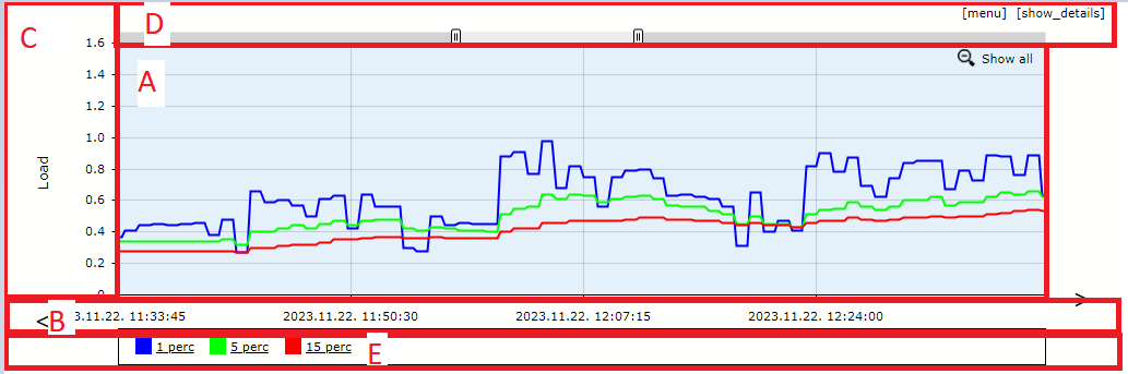
Figure 91. JavaScript chart I.
As the figure shows, the chart can be divided into several areas:
- Value area (A): It shows the chart element values as lines or areas. If the mouse pointer is placed over this area then a vertical line and a text box below it shows the current time, while if it is turned on then the actual values of the chart elements are displayed in text boxes next to the line. If the user zoomed in then he can zoom out using the “Show all” link. The [menu] link is also displayed here. The user has to click on it to access the interactive functions. The options are hidden again if the user moves the cursor over the menu options and then moves it away or if he clicks on the [menu] item again.
- X axis (B): Time axis, with optional arrows. The displayed time interval can be changed easily with these elements, moving back and forth in time (the later is only allowed if not moving past the current time). The use of the arrows is the same as if the user would manually set the From and To fields in the Time span browsing area: it will be set for every chart on the page.
- Y axis (C): It shows the value axis as well the unit of the chart
- Upper area (D): If the user moves the mouse pointer over the [show details] link then he can see the minimum-average-maximum and last values for each chart elements. If the chart is zoomed out then there is a slide bar on this area which can be used to change the displayed time interval.
- Legend (E): It shows the names of the chart elements and this area can be used to turn on and off the elements as well the value text boxes
The JavaScript based charts offer several client-side interactive functions. The user can zoom in by selecting a time interval on the area A and he can use the “Show all” link after that to zoom out or use the slide bar on the area B to change the displayed time interval. If the user selects less then the third of the original time interval and the resolution of the chart makes it reasonable then the application offers the reloading of the chart data for that particular time interval. If the user accepts this then it is the same as if he would manually set the From and To fields in the Time span browsing area: it will be set for every chart on the page.
Another interactive functionality is the turning on and off of the chart elements and their value text boxes. The figure below was created by modifying the chart seen on the figure above: the Out element was turned off as well the value text box for the In element:
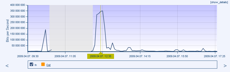
Figure 92. JavaScript chart II.
The elements can be turned on or off by clicking on the checkboxes next to them. The value text boxes can be turned on or off by clicking on the element names. The turning on and off of the elements and their value boxes isn’t allowed for all charts: this functionality is disabled if the chart contains both stacked and non-stacked elements (for more detail see the “Public and private charts” section).
When we click on the [menu] link then the application shows several custom menu items. Not every feature mentioned below is available for every chart: if a feature is not available then it is not shown in the right click menu list.
The "Hide every chart element" can be used to hide every element on the chart: if we want to show only one element and there are lots of elements on the chart then it's easier to use this menu instead of hiding them one-by-one. The "Show every chart element" will turn all of them on.
The "Minimum and maximum setting" allows the user to change the minimum and the maximum value (for example 10M and 30M). Although the user can set these also one the Browser area for most charts, this is different, because it will set the values only for this chart and it won't require any client-server communication, i.e. it is much faster.
The "Set trendline" allows to set a trend calculation for any element. PVSR supports the following trend line types:
· Linear
· Moving window average and sum: it shows the average or the sum of the values during the last N samples or the specified timespan
· Baseline: average +- X deviation based on previously collected data. The user can choose Daily or Weekly cycle for calculating the base line and also can choose the resolution from hourly, four hourly and daily, meaning the timespans on each date PVSR should look for past values. For example when calculating for Friday 10am and the user chooses Weekly cycle, last 2 cycle and four hourly timespan then PVSR will take the previously collected data from the last 2 Fridays, between 8am and noon. On the other hand if the user choose Daily cycle then PVSR will look at the last two days and if he chooses daily resolution then it will look at the last two whole Fridays
· Polynomial up to the x6
· Difference: the difference between the current value and the previous value will be shown
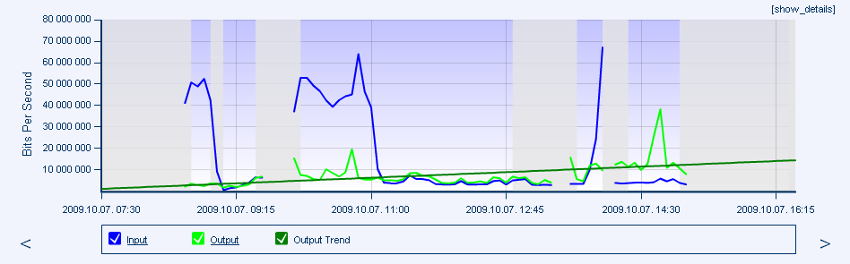
Figure 93. JavaScript chart with linear trend for the Output element
We can also place horizontal guide lines onto the chart using the “Configure horizontal guide lines…” menu. We can have as many guide lines as we want: specify the value in the text box and click on the [add new] link to create a new guide line. Similarly to the minimum and maximum settings, the prefixes K, M, G and T can be used. Open the menu and click on the [del] link in the row of the guide line you want to delete.
There is also a manual threshold configuration option: when a user views a chart then he can create a threshold more easily using the [menu] on the chart and then selecting the Threshold configuration element. For more detail see section 11.8 Threshold configuration using charts.
These interactive settings will not be preserved if the user switches to another tab, chooses a different time interval or the data for the chart gets automatically refreshed; except the trend lines.
9.2.1 Real-time monitoring
The real-time monitoring is also a JavaScript chart interactive feature. It is only available for measurement charts under the Measurement and the Alarms menu and only if every element on the chart belongs to the same equipment, that equipment supports real-time monitoring, the data collection is activated for the equipment and the real-time monitoring is enabled for every measurement type on the chart.
In real-time mode PVSR collects data more frequently and displays the collected data virtually instantly. It does not store this data in the database so enabling the real-time mode will not unnecessary populate the database with lots of data. This data is kept on the server only during the real-time monitoring session, and during this the “Export to XLS” link also refers to this data, meaning:
· The data can be exported into Excel until the real-time monitoring session is not finished
· Once the real-time monitoring session is finished, the data is lost
Usually real-time is only used to see the current values, so PVSR automatically zooms and scrolls the chart so that only the last 60 values are shown on it. Obviously the chart can have more data than just the last 60: by default PVSR keeps the data for the last 60 minutes on the chart, although this can be configured to a smaller value if the chart consumes too many CPU and/or memory on the client machine. Even if the data is not shown the chart it can be accessed using the “Export to XLS” functionality.
PVSR also automatically stops the real-time monitoring after a while, so it won’t go on forever even if the user closes his browser without stopping the operation. By default PVSR stops the real-time monitoring after an hour, this can be increased to one day.
The real-time monitoring feature has three settings:
· Collection cycle in seconds: its minimum value is dependent on the settings for the measurement types on the chart, but usually it can even be 1 second. Just keep in mind that the 1 second real-time collection means that:
o PVSR tries to get the data every second, but this might not be possible: for example a measurement could take 2-3 seconds
o Even if PVSR is able to get the data every second, the measurement might be a counter – when PVSR displays the increase of the value – and the monitored equipment might not update this counter every second
· Show the last number of minutes on the chart: its default value is 60 minutes, it must be between 5 and 60
· Stop after (minutes): its default value is 60 minutes, it must be between 5 and 1440 (one day)
There are four icons for each real-time monitoring chart as shown below:
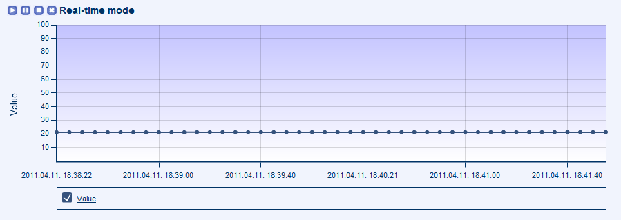
Figure 94. Real-time monitoring
· Play: restarts the chart refreshing
· Pause: pauses the chart refreshing, but the real-time monitoring continues and the chart refreshing can be restarted
· Stop: stops the chart refreshing and the real-time monitoring and it cannot be restarted, but the session is still active, the data can be exported into XLS
· Close: closes the real-time monitoring session, the collected data is lost (unless it was previously exported into XLS)
The real-time monitoring is only available on the current tab in PVSR and the page content must not be changed (page refresh, navigating in the site-equipment hierarchy, …), otherwise the real-time monitoring session ends (and the data is lost). To protect the user and the data from accidental losses PVSR displays each time a warning message when a real-time monitoring session is about to be closed:
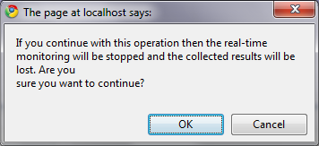
Figure 95. Real-time monitoring closing warning