| Previous | 10 Viewing Alarms | Next |
|---|
10.2 Navigation, filtering and viewing alarms
The Browser, on the left hand side of the user interface under the main menu, is used to filter and arrange the alarms. There are three groups in the Browser, each of which controls the display of alarms in a different way. The individual groups can be “closed” and reopened by clicking on the button on the left edge next to them, which can useful since this panel has no scrollbar. Filtering of alarms can only be set with these groups if a set of alarms is already selected on the top part of the screen.
The individual groups from top to bottom (a tooltip is also displayed if the mouse pointer is moved above an icon):
10.2.1 Time interval
The real-time view can be selected with the first clock icon; in which case the currently active alarms are displayed in the table. In this case the UI shows the refresh cycle as well (its default can be set on the Preferences page) and on the main area of the UI it also shows the time until the next refreshing:
By clicking on the second icon (“Historical view by date”) a Calendar is displayed in which the desired day-week-month-year can be selected with a couple of clicks (for the detailed usage of the Calendar, see subsection 12.1).
The third icon (“Historical view by time”) allows the user to specify the time interval accurately with second precision.
The time zone can also be chosen here once at least one time zone is configured in the system.
10.2.2 View
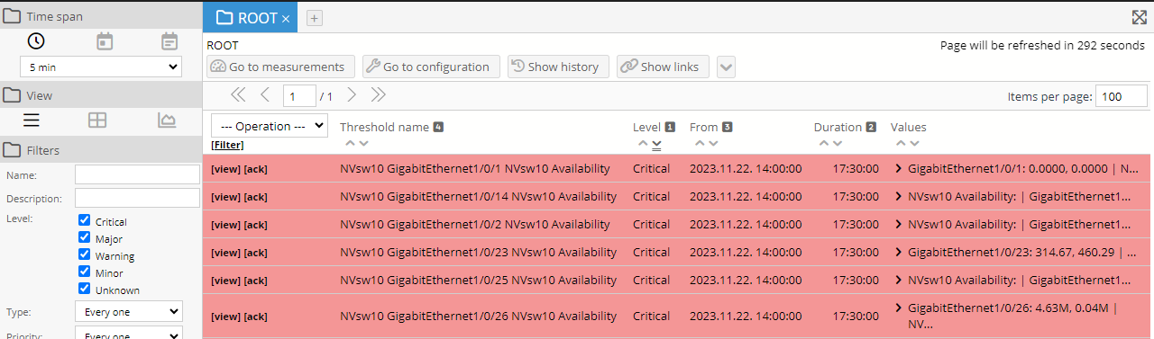
The way the alarms are displayed in the middle of the screen can be changed with the second group of controls. By default the already discussed table is displayed (leftmost icon).
By selecting the middle icon (“Object view”), the current site – virtual site hierarchy is displayed with icons instead of the table of alarms. By default only those objects are visible for which there is an active alarm. This can be changed by clicking on the “Show non violating objects” button. The icons are colored by the color code of the most severe alarm of the contained equipment: for example if under a site there is an equipment with an active “Critical” alarm, then the color of the site’s icon is red; if the most severe active alarm of the equipment under the given site is “Major”, then its color is orange, and so forth.
In the “Object view” four further icons appear in this group of controls on the left hand side, which are used to further tailor the object view as follows (from left to right):
- Icon view: The sites containing alarms are displayed with large, easy-to-see icons, at most five in a row.
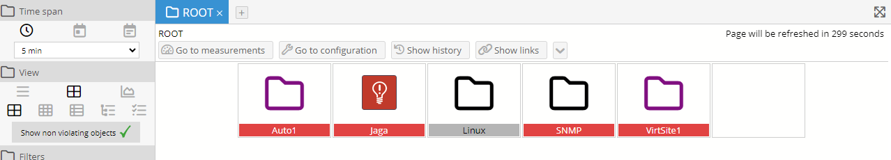
Figure 100. Icon view of alarms
- List view: The sites containing alarms are displayed with smaller icons (at most five in a row) allowing much more icons to be displayed on a single screen among which those with alarms can easily be identified based and their color codes.
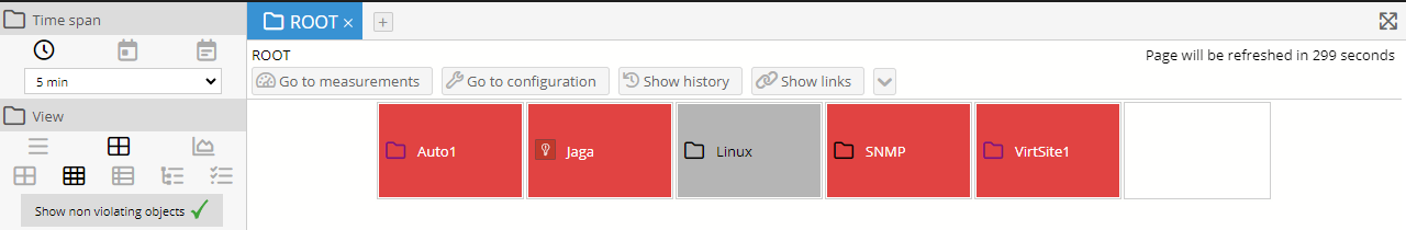
Figure 101. List view of alarms
- Detailed view: The site/equipment icons are listed one under each other, together with their names, descriptions, types and for virtual objects the user who has created them. Unlike the other two views, this one doesn't only show the highest alarm color: it shows for every alarm level the number of violations.
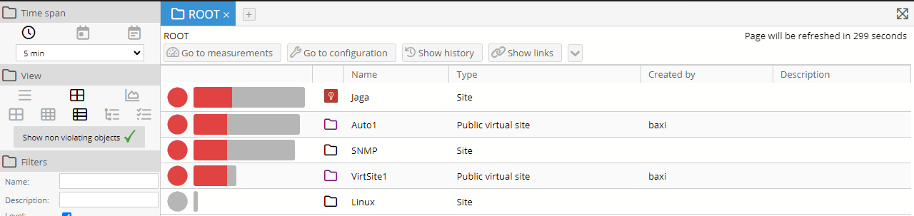
Figure 102. Detailed view of alarms
- Tree view: This view also shows only the highest alarm level, similar to the Icon and the List view, but here the user can open the different parts of the tree hierarchy and look at the cause of the higher level alarm coloring
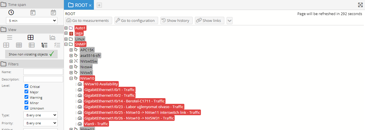
Figure 103. Detailed view of alarms
o Thresholds: This view is somewhat similar to the default alarm view, but this time PVSR displays threshold definitions instead of alarm violations. So for example if there were multiple violation intervals for the selected time period and for the same threshold than only one line is shown here, instead of multiple lines. The duration is not shown in the real-time view and if it is shown then it does not mean the duration of any particular violation interval. Instead it means how long the threshold was violated during the selected time period. If the entry is assigned to one or more measurements then they appear in the Measurement column where clicking on the [view] link shows the chart for that measurement with the alarm information (same as the [view] link on the alarm details page reachable from the default alarm list page)
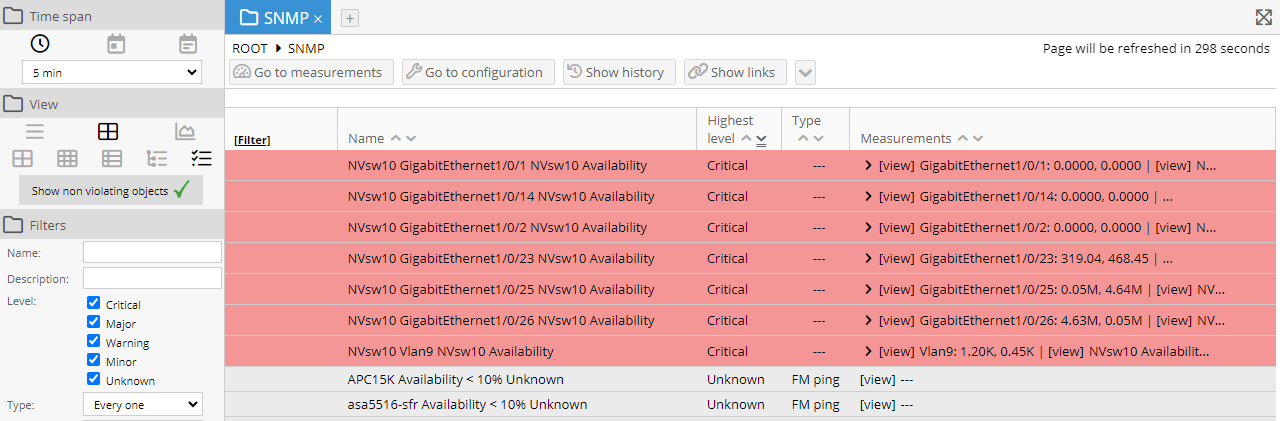
Figure 104. Showing thresholds below a site
In the first three views we can navigate to a site by clicking on its icon, in which case the contained sites and equipment are displayed in a similar view. As mentioned in section 3.4 Using the display tabs, the user can also use the right and middle (wheel) mouse buttons and the Ctrl + left mouse button combination on the name and the icon of the site/equipment. Following the hierarchy downward this way we can reach the equipment causing the alarm, and then by clicking on the icon of this equipment then we see a similar page as for the fourth “Thresholds” view, except in this case there are subtabs for the different information:
· Properties: the equipment’s main parameters
· Alarms: the thresholds with their current statuses
· Optional other subtabs pointing to other related equipments
By clicking on one of the [view] link in the Measurements column PVSR shows the chart for that measurement. On this lowest level the user also has the opportunity to choose a threshold that is currently not violated in order to check the settings of the threshold value.
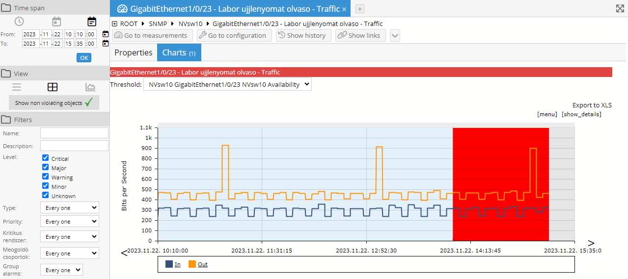
Figure 105. The equipment level view of an alarm
During navigation the navigation path is displayed in the top line above the middle viewing area (under the name of the tab), which can be used to quickly navigate up to higher levels by clicking on its segments.
With the right icon in the group (“Chart view”) the number of active alarms can be displayed in a graphical form. This view can only be selected if the current time interval is not the real-time view (that is, this view can only be selected for historical time intervals that do not contain the current time instant). On the next figure the number of alarms in the morning of April 7th, 2009, is displayed in the chart (all alarms happen to be of “Critical” level):
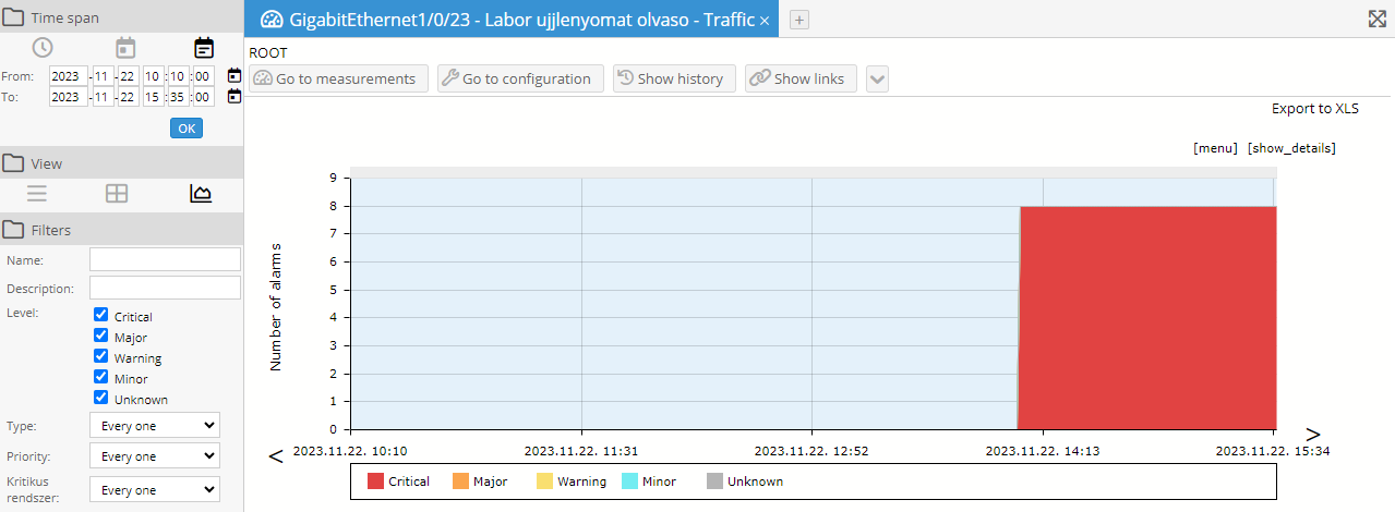
Figure 106. The number of alarms displayed in a chart for a given time interval
10.2.3 Filters
In the browser of alarms the third group is named “Filters” and allows the specification of filter-conditions of alarms of the following types:
- Name: the name of the threshold (which typically contains the name of the corresponding equipment, such as “E1909 low availability”). The usual %, *, _ and ? characters can be used here and the filtering is case insensitive
- Level: multiple checkboxes which can be used to filter on the threshold level. The default setting of each checkbox can be set on the Preferences page
- Type: dropdown menu, can be used to filter on the threshold type.
- Grouped: dropdown menu, can be used to set whether the normal and/or the group alarms should be displayed.
- Acknowledged: should the already acknowledged alarms be displayed too
The filter is activated by clicking on the “OK” button. This type of filtering is most useful in List view (since there the name of the alarms are displayed and not that of the site or equipment) but it works in Object view as well.
10.2.4 Unknown grouping
The alarm menu contains three types of alarms:
· Threshold violations
· Alarms from SNMP traps or SYSLOG
· Alarms representing groups of Unknown threshold violations
The Unknown level means that a measurement has one or more threshold definitions, but none of them could be violated because the measurement itself is not successful. This can happen in two cases: either there is a problem with the measurement or the application cannot access the equipment at all. This later case might cause that all of the Unknown thresholds will be violated for an equipment. The UI offers a way to group these Unknown alarms together so the users can distinguish between these two cases.
First the percentage of the Unknown thresholds has to be selected for the equipment level, meaning that if more than the specified percentage of these thresholds are violated then the UI should group them together. An alarm severity also has to be selected: these alarm groups will be shown with the selected severity. After this optionally a similar grouping can be selected for the site level, specifying the percentage of equipments which have to have an Unknown alarm group in order to group them together at the site level.
These alarm groups are only present on the UI according to the user’s selection, meaning that acknowledgement, unacknowledgement and commenting means the same operation for all the groups Unknown alarms and the [view] link shows not a threshold but the alarms which were grouped together.
There is another way to “hide” Unknown alarms, by specifying so called “availability” measurements at the collector type level, see 6.4.7 Unknown level threshold wait
10.2.5 Graphical analysis of measurement values causing alarms
As we have seen in Figure 105 the measurement values causing the alarm can be displayed in a chart. See the section “Using the charts” for a detailed description of the chart system.
10.2.6 Excel files
The displayed data can be downloaded in XLS format by clicking on the [Export to XLS] link above the chart. The first few lines of a sample exported XLS file are:
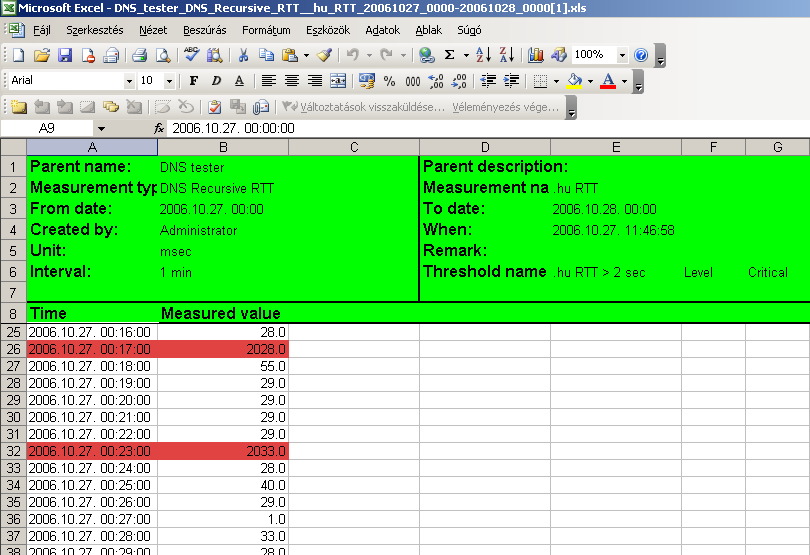
Figure 107. Sample XLS file
As can be observed, the generated XLS file containing the measurement data also includes the name of the threshold “.hu RTT > 2 sec”, and the background color of the data cells that violate the threshold matches the color code of its severity level. If threshold violation occurred, but that value was not taken into account in the current alarm, then the background color of the cell is set to cyan.
If the measurement is of enumeration type then the Excel file contains both the measured values and their enumeration names.
If public or private (as opposed to normal) chart is exported to an XLS file, then the generated file differs in the following way:
- There are that many columns and with the same names as in the chart definition
- Regardless of the chart definition the values are not aggregated
- The resolution of rows follows the smallest time interval of the measurement data, thus infrequent measurement data are stored sparsely in the table
Besides the measurement data, the graph of alarms is also saved, in which case the columns contain the number of alarms of different levels in the given time interval. The first few lines of a sample XLS file are:
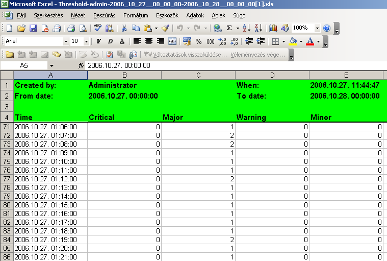
Figure 108. Sample XLS alarm graph
It is also possible to save the table displayed by default to an Excel file. The first few lines of a sample XLS file are:
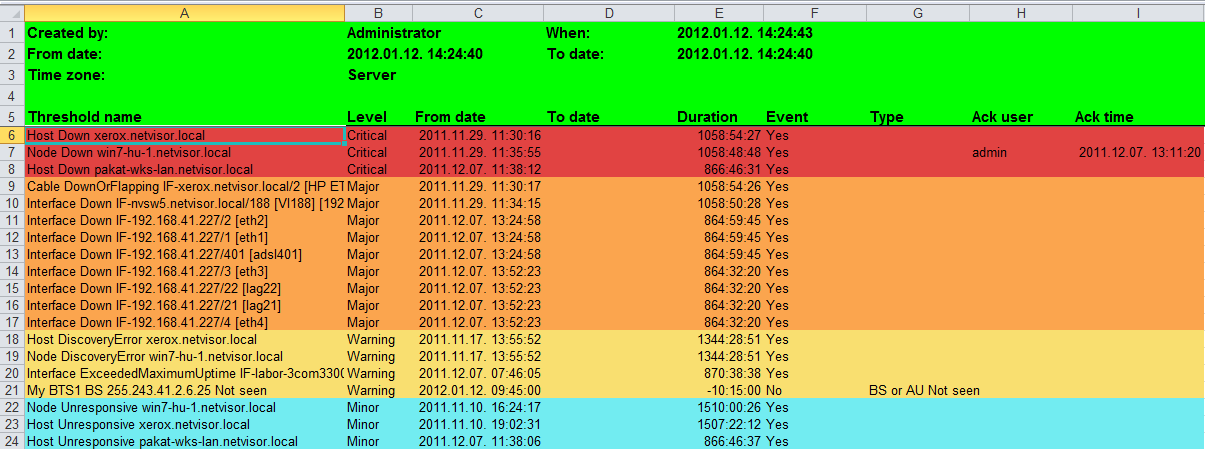
Figure 109. Sample XLS alarm table